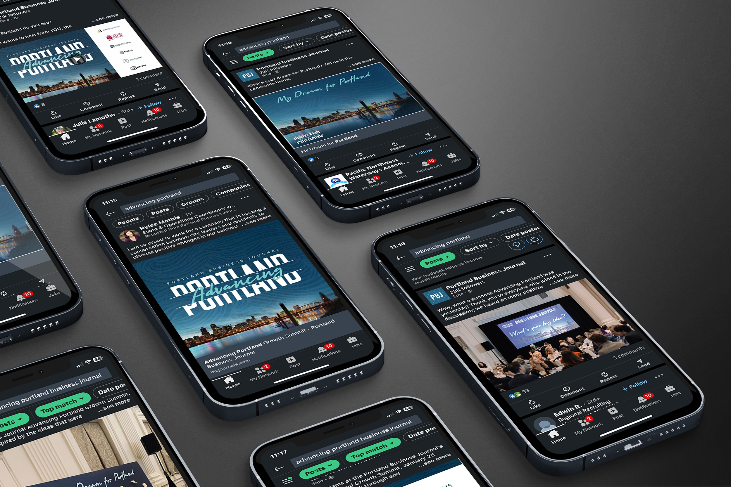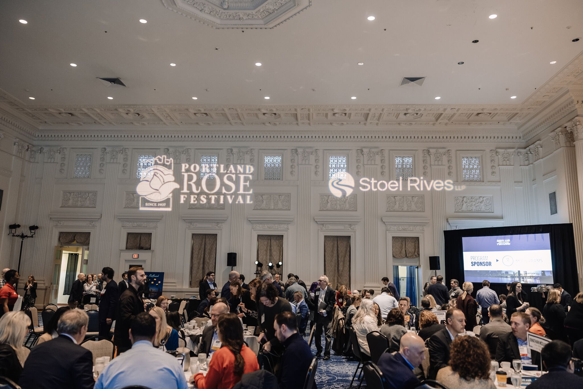
Themes of reflection, optimism and hope carried my design philosophy for this event, as the Rose City pushes forward.
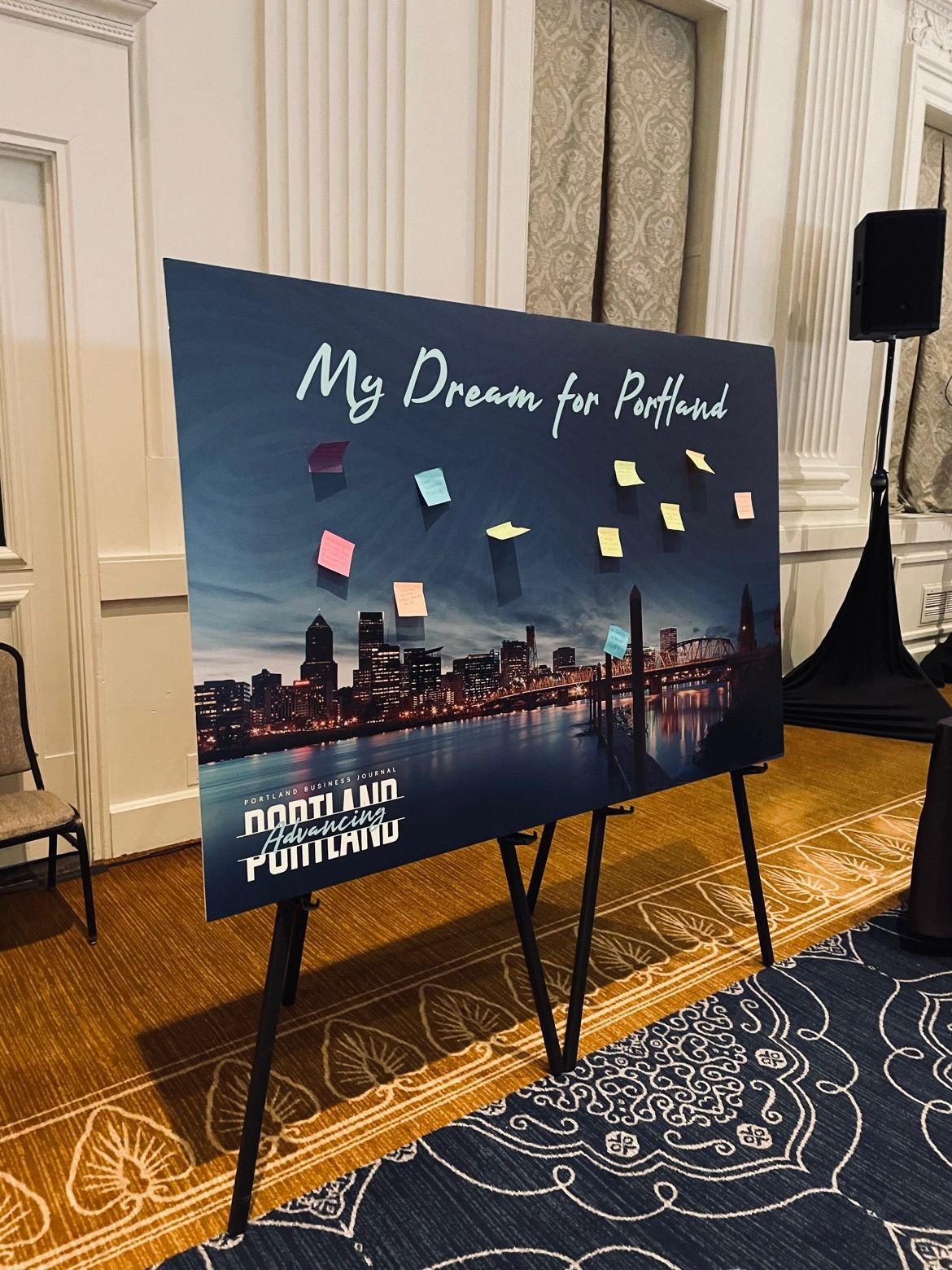
When charting a course forward, reflection i’ve found, is crucial. Reflection to where we’ve been, to the obstacles faced, to the lessons learned, and to the opportunities that lie ahead. And in picking this image of Portland’s cityscape overlooking the water, where the sunrise is just about to break the horizon; I strove to communicate this ideal.
For the logo I went with a combination of a San-Serif font and a handdrawn / brushstroke to symbolize both the business lens of this event, but also the very human factor in an entire city turning a new page.
I selected a calming blue gradient highlighted a brighter teal, as the event’s primary colors, further evoking that image of an early morning dawn before the sun.


