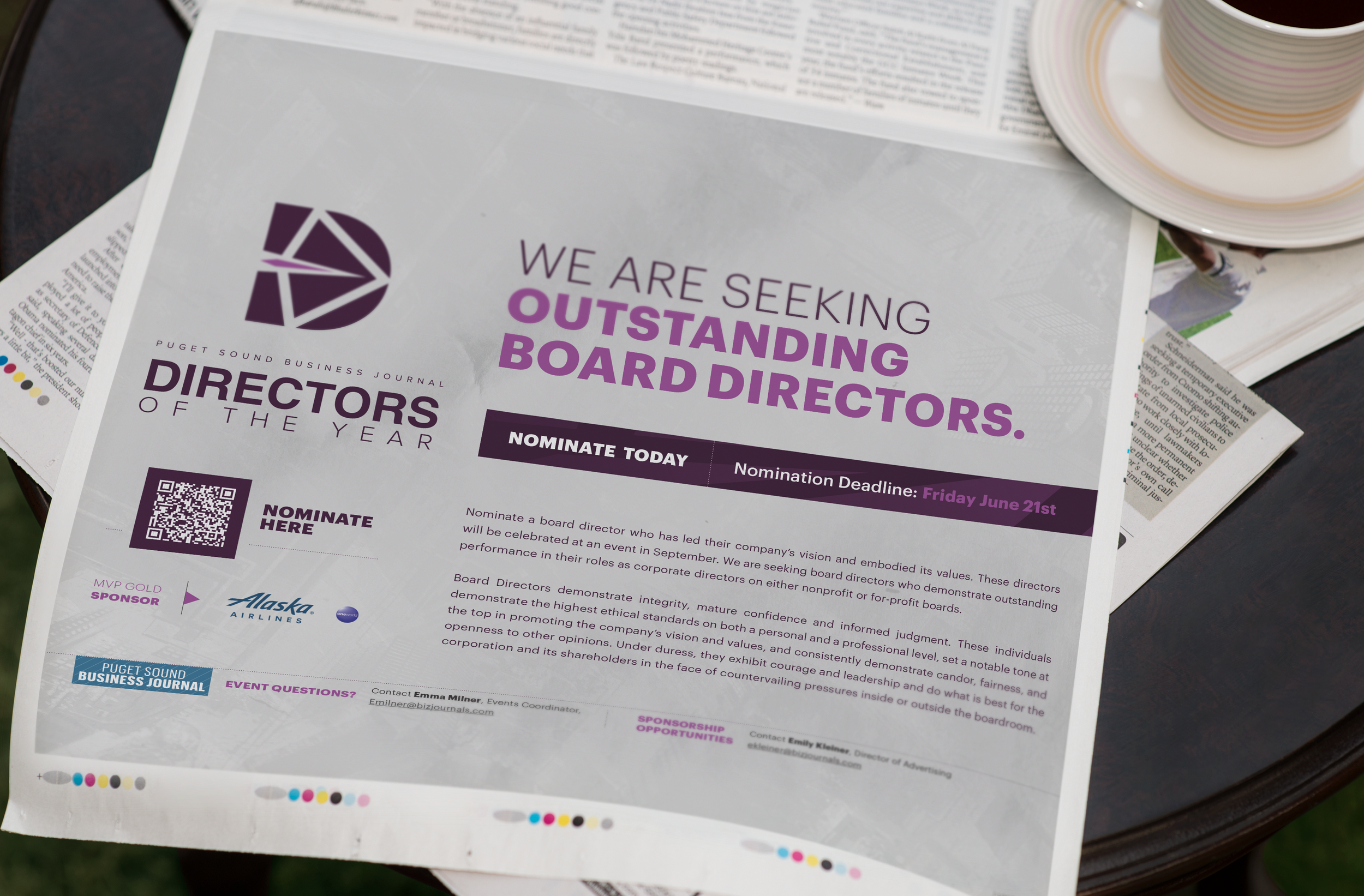
Much like an archer, directors operate behind the scenes, launching their business forward.
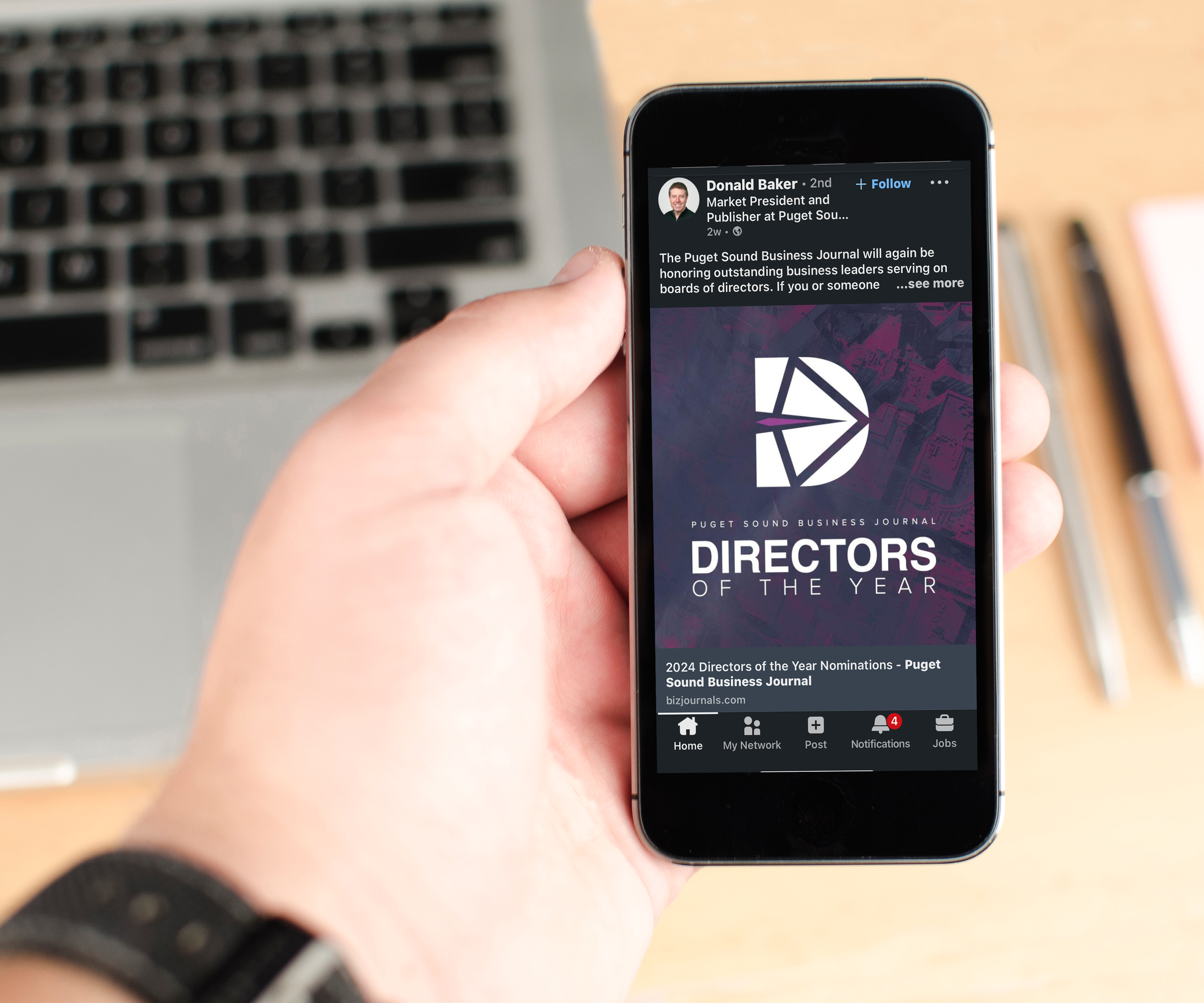
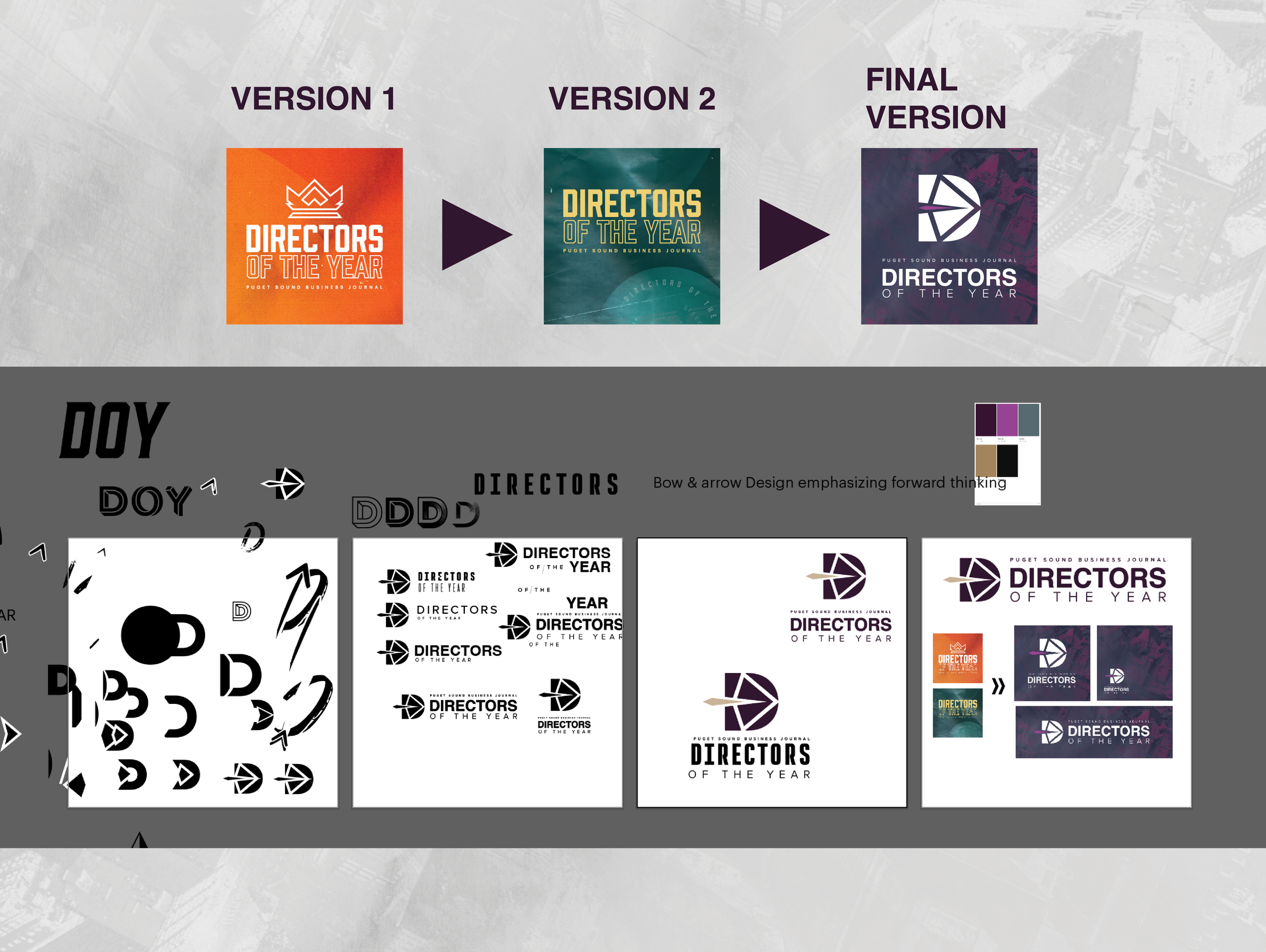
To be honest, for a little while i struggled to come up with a concept for this event. I wanted to avoid this event being mistaken for a “film director” type event, so I went with a bold and orange crown based logo. My event director told me that that look was too bombastic, and that Directors are more subtle in their actions they do to propel their businesses. And thats when the imagery of an archer struck me, and thats what i built the logo mark around. For fonts I went with cleancut & straightforward san-serif fonts to communicate professionalism. For the colors, I wanted the pallette to be reserved with flashes of dynamic energy, so I went with a primary purple and a secondary magenta color. Background design is a faded overhead shot of Downtown Seattle to further contextualize the locale of this event.
